Cuneiform—new life for a dead script: Rendez-vous of extinct languages
Abstract
Cuneiform is a multilingual script. Even though introduced to Unicode long ago, scholars in Ancient Oriental Studies are well aware of the fact that a bit more may actually be needed to let it really make sense in the context of modern-day media. Now, a new font family is produced, aimed at rendering complex sign lists by taking into account the different stages of development as well as a small universe of language variants. In close exchange with people active in the field, a web-based multilingual input method is under development, improving and widening the visual display of Cuneiform signs in a digital surrounding while keeping up the typographic standards of Roman transliteration systems used in science today. The project, requiring both a basic knowledge of Cuneiform writing, history, and the necessities of its present-day usage, no less than skills in typeface design, typography, and coding. It represents an individual answer to the question what a typeface designer could actually do for science.Cuneiform—why now?
To start with a personal note, I have always been fascinated by the cultures of Ancient Mesopotamia, leading me to start studying Arabic at young age. Yet in those days, online resources being comparatively hard to get, it was difficult to self-study Sumerian or Akkadian, let alone learn the script. This perspective made me think about what I could contribute to an improved presence of Cuneiform as part of our modern-day typographic inventory, important for scholars in the field of Ancient Oriental Studies. Though I did not pursue a career in science instead of art and design myself, questions such as these made me develop into the person I am: An information designer, typographer, typeface designer with a strong crack on languages and scripts, modern or ancient, “alive” or “dead”.
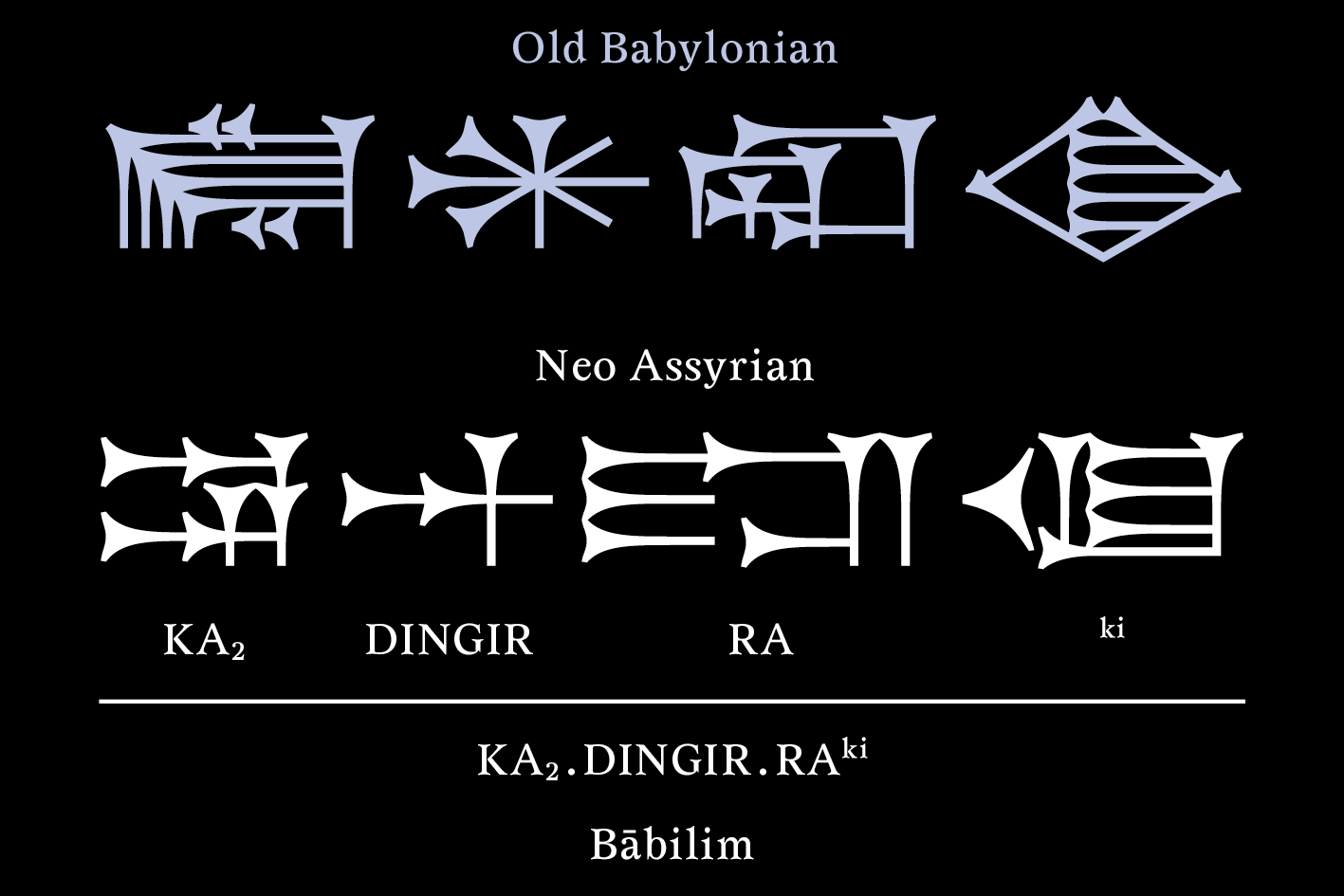
Times Old Akkad (Old Babylonian, above) and Times New Akkad (Neo-Assyrian, below) alongside the Latin transcription system. ‘KA2.DINGIR.RAki’ is a so-called Sumerogram, making the name of Babylon seem more ancient than it actually was. Only the first two signs are read “Bābilim” in Akkadian, the rest remaining ‘cultural hot air’.
Cuneiform is a world of its own. Though abandoned in the first century A.D., 3.000 years of development can be roughly divided into four phases—the early Sumerian days, an Old Babylonian time, the Assyrian age, and a late period—in which the visual appearance underwent significant changes. Besides Sumerian and Akkadian, other languages adopted (and further changed) Cuneiform: Elamite, Hittite, Hurrian, Median, Persian, and Ugaritic. The differences can be drastic, a bit as if you imagined Latin, Cyrillic and Greek were considered as one and the same script.
When Cuneiform was introduced to Unicode, some scholars were not fully satisfied with the result, stating a number of missing signs, or the “alphabetic” order used instead of the more widespread stroke-related order, to conclude “the dogma ‘There is no code but Unicode and Unicode is the standard’ is not valid for cuneiform studies”. However, I consider this a bit far-fetched, Unicode still serving as a valuable basis to work with, taking into account the potential of typeface design, type tech, typography, and coding, as a means to help out for more complex duties.
In recent years, Cuneiform has entered Wikipedia. “Esagila”, the font mainly used to render the script, is in Old Babylonian style (OB). This being great in itself, it would be even greater to have the Neo-Assyrian sign variants also displayed using the same font (right now, image files are often used to show them). Standard works such as Rykle Borger’s “Mesopotamisches Zeichenlexikon”
Johannes Bergerhausen produced an awesome Cuneiform font for his books “Digital Cuneiform” and “Decode Unicode”. The thing is, like with “Esagila”, it “only” follows the Unicode standard in a rather ancient style (Ur-III, to be precise). This phenomenon could be compared to a Traditional Chinese font used when you also need simplified characters.
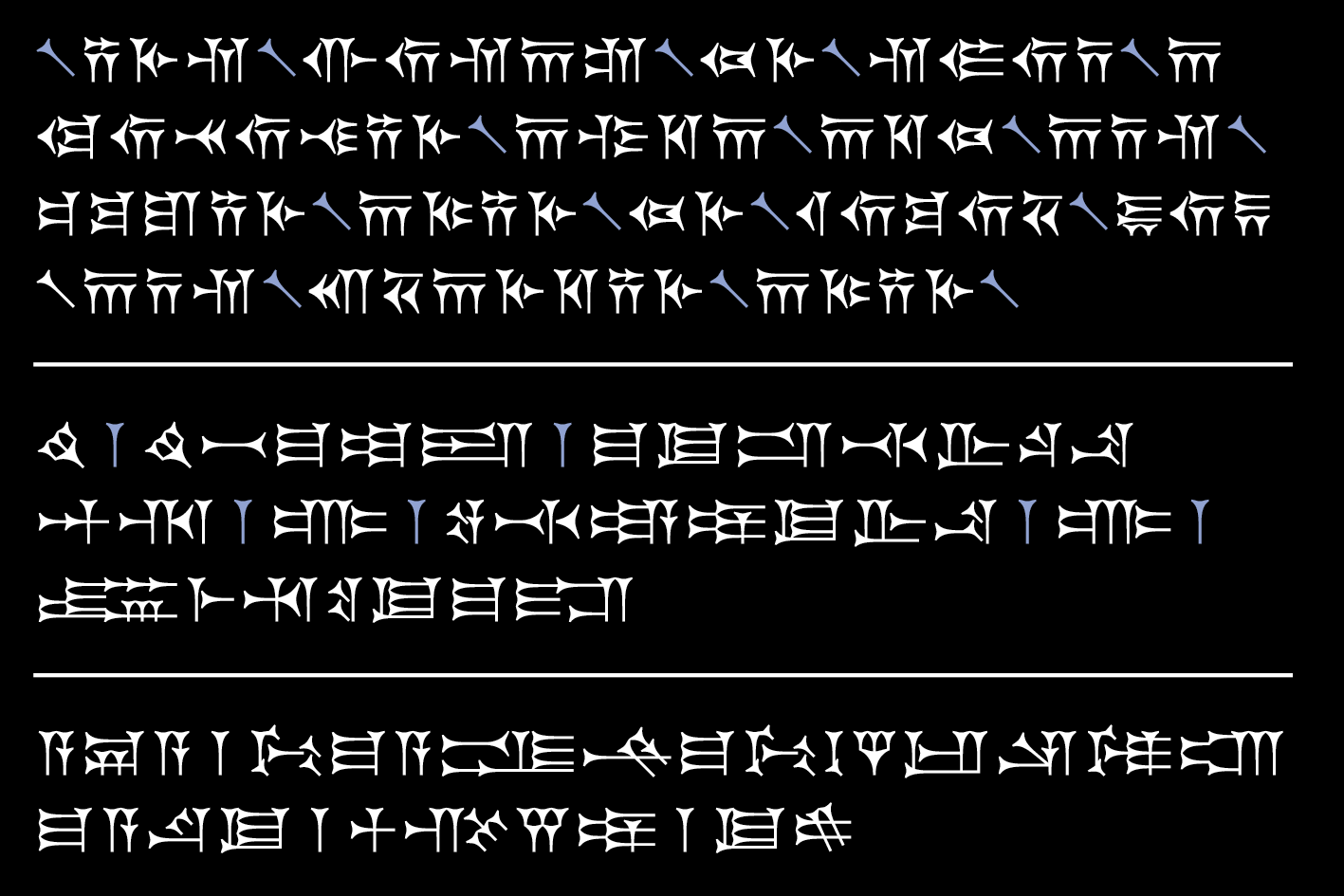
Times New Akkad in use, showing a trilingual excerpt of the Behistun inscription: Old Persian on top, Elamite (now, still using only Neo-Assyrian signs), and Babylonian (Neo-Assyrian signs in Neo-Babylonian style). Word separators are highlighted in blue.
The font family needed is none containing light or bold weights, but legs in the style of different periods and regions. If you imagine them being engraved into a wet clay tablet or stone, the visual appearance would be very consistent. But online media are not made of clay, thus, we need a font family of coherent design. And who is doing that stuff? Typeface designers.
Scholars are fine with seeing only one of many renderings of a sign, they understand its meaning anyway. However, I am worried a modern legibility might impose itself on the script’s diversity in shape or context. Imagine a text from the Niniveh collection exhibited at the British Museum. It is written in Neo-Assyrian style. Now find it displayed using an Old Babylonian font on the web. Although scholars may not mind, from the visual point of view it feels almost like a Tweet typed in Schwabacher. Though one might argue that more choice could lead to more confusion, I am sure that more sensitivity toward Cuneiform in present-day media will eventually arise, as a sign of respect we owe to its cultural value—here and now.
Interplay of four disciplines: Font family and input method
My “Times New Akkad” and “Times Old Akkad” are fonts designed in a lapidary style. While science uses outline fonts to copy clay tablets and filled ones for inscriptions in stone, this distinction has become of lesser importance in the days of the world wide web. Like serif fonts refer to monumental inscriptions in stone or marble (at least the uppercase letters) and are yet regarded as perfect text typefaces even in the 21st century, the choice for a lapidary Cuneiform is almost self-evident. Even though scholars expressed their wish to also have a cursive (not italics!) or a leg for archaic forms, lapidary has become the most frequent style in the digital world—texts like ‘carved in stone’.
It seems reasonable to think that for me as a typeface designer, the actual process of font production should be the easiest thing to achieve in the context of this project. That is true, regarding the technical and aesthetical aspects—the way characters should be drawn and optically harmonized. However, some research has to be done as to determine a whole bunch of sources from different times and places. For example, it is easy to find Neo-Assyrian and Old Babylonian signs in Šašková’s sign list, but their late Babylonian counterparts only appear in René Labat’s “Manuel d’épigraphie akkadienne” from 1948, a hand-lettered book printed as a facsimile! I am sure his list is far from complete and can only wait for someone to supply me with better resources. Briefly put, some more exchange with scholars is highly needed, and a certain acquaintance with the logic or grammar of Akkadian crucially matters, leading me to become something like a hobby assyrologist.
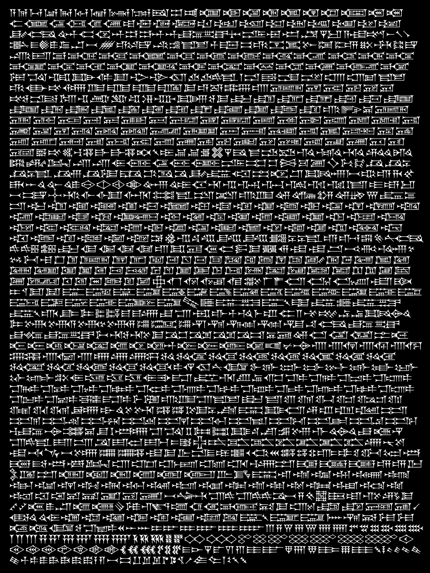
Times New Akkad (Neo-Assyrian) Cuneiform signs, excluding ligarures, regional variants, and crossing signs.
However, exchange with scholars in the field of Ancient Oriental Studies led also into another, unexpected direction. Besides encouraging me to further pursue my font project, all of them expressed the need for a new Cuneiform input method. A useful online tool by the University of Pennsylvania, “Cuneify”, being pretty basic both in design and usability, it is probably not so much the characters themselves that matter most, but the sheer act to compose them into text. With “Cuneify”, there is no soft keyboard at hand, helping the user to type special letters of the Latin transliteration system, such as “ḫ”. Then, after typing that transliteration and pressing the “cuneify” button, the result is shown on another page, making it impossible to trace back mistakes. Would it not be wonderful to see the correct transliteration and the same text in Cuneiform on one and the same page, with any changes adapted live? If you could switch between different legs of the font family to render the text in Old Babylonian, Neo-Assyrian, or others? Imagine you could transfer your compositions to the Microsoft Office context, using templates especially prepared for the task? JavaScript, CSS, and XML workflows could actually make this work. Anyway, UI design and typography are of crucial importance, the new platform having to be intuitive, practical, attractive, and fascinating at the same time.
Scholars would agree to the fact that Roman transliteration of Akkadian, Sumerian, and other above-mentioned languages is of the same importance as the Cuneiform signs, changing the concept of an input method to a multi-script project. Actually, most scientific publications exclusively rely on transliteration, older ones still produced using typewriters. Some unusual habits for rare cases, such as subscripts in superscripts (mind-boggling!) make Latin typography in the Cuneiform context a more complex matter than actually expected.
Setting off with the simple question “What would scholars in Ancient Oriental Studies want from a designer?”, I was led by the answers to become a different person: more open for unexpected challenges, learning new skills, going outside the box at least a bit.