Roman Wilhelm
羅小弟
⬇️ Visual work ➡️ Musical work
Between cultures and languages: Graphic design, typography, typefaces and music
As a Berlin-based graphic designer, my work focuses on type and typography, multilingual layouts, trans-cultural topics, and the relationship between visual communication and sciences. As a songwriter and composer, I produce electronic sounds with inspiration from post-punk, Krautrock and folk music under the name roman946.
Visual work
I studied communication design at Burg Giebichenstein University of Art and Design Halle, and typeface design at Leipzig Academy of Fine Arts. In 2002, I spent six months as a trainee at the German Delegation of Commerce in Shanghai, which sparked a lifelong fascination for Chinese culture, language, art, and characters. Since 2006, I am teaching typography, typeface design and calligraphy at various academic institutions in Germany and abroad. As a member of the Multilingual Typography Research Group at Zurich University of the Arts, I contributed to the book “Visual Coexistence—Information Design and Typography in the Intercultural Field”, edited by Ruedi Baur and Ulrike Felsing. Now I work both as an information designer at the German Institute of Economic Research (DIW Berlin) and as an academic teacher in the Typography Lab at Berlin University of the Arts (UdK Berlin), and further my (multilingual) typography research, design projects at the crossroads of type and science.
Recent activity
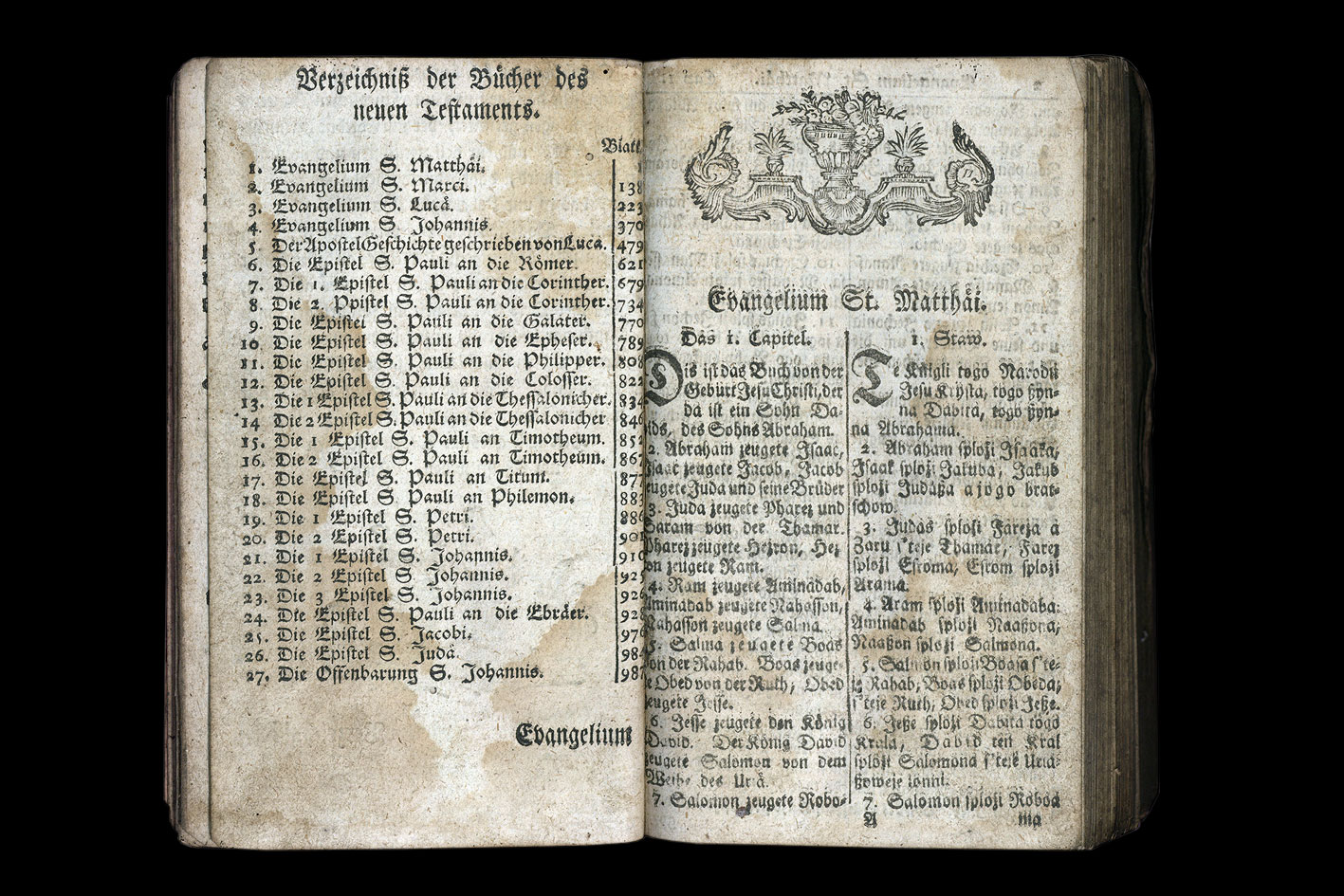
On August 27, 2025, I held the lecture “Between languages and writings. Historic Sorbian books” at the Sorbian Institute (Serbski institut) in Bautzen/Budišin. During a bicycle trip through the Oderbruch region not far outside Berlin, I had found a bilingual Germnan-Sorbian New Testament from 1788 on a flea market, bought it for a fiver (!!) and brought it home to the Institute, where it is now being restored and safeguarded. I spent a fascinating day between the books of their collection, and am excited to return for a lecture on the multilingual aspects of Sorbian books. Before the talk and interesting exchange with the researchers, staff and enthusiasts, Sorbian newspaper Serbske Nowiny even brought an interview with me by Anna Měrćinowa.

New Testament in German and Sorbian, translated and published by Johann Gottlieb Fabricius (1709), 6th edition of 1788. German on the left, Sorbian on the right.
Publications (work in progress)
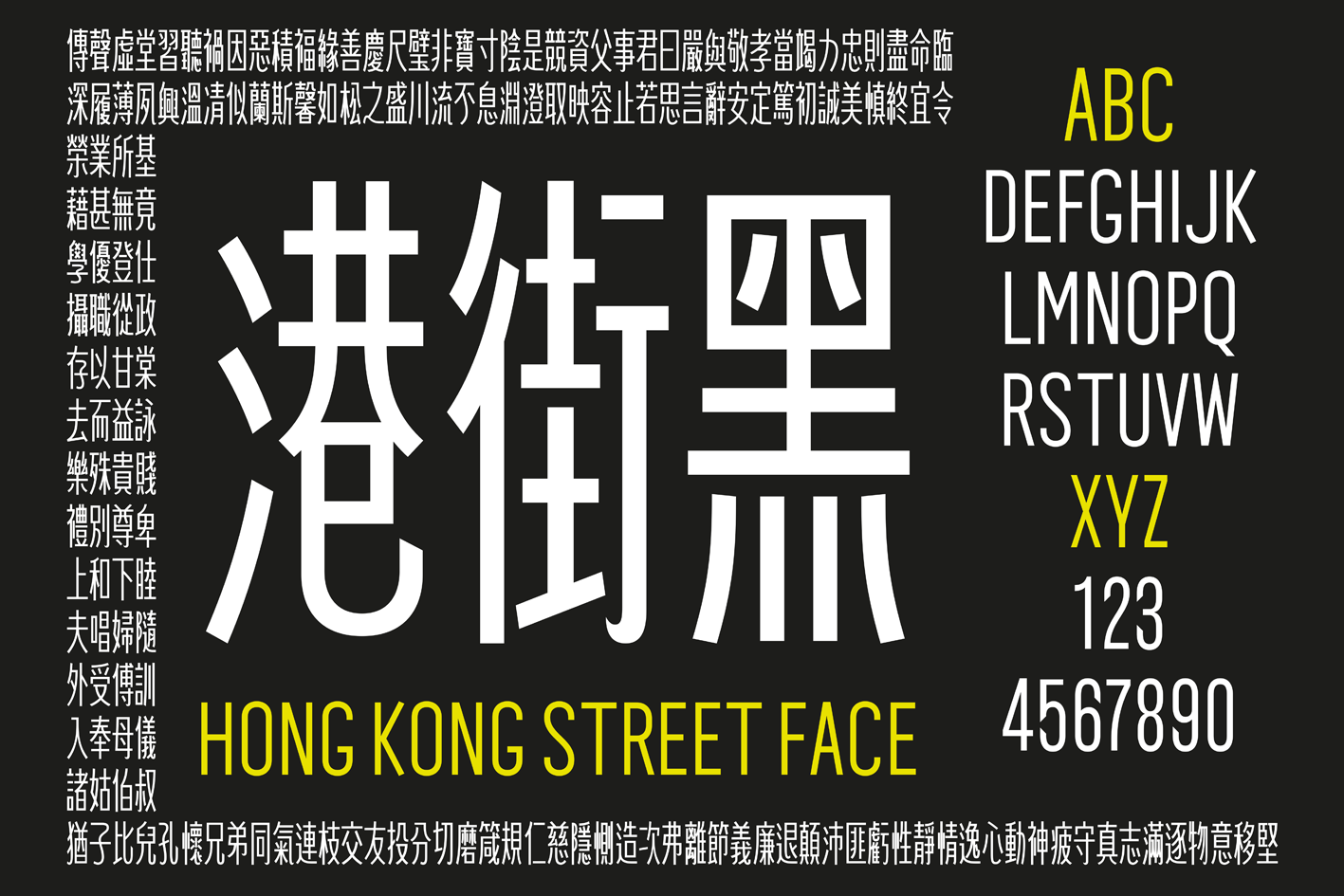
After my first Chinese typeface “Laowai Sung (老外宋)” had been published by Arphic Type (Taibei) back in 2015, it took ten years from the first ideas to a full CJK font development with more than 40,000 glyphs, five different design locales (Taiwan-style Traditional Chinese, Hong-Kong-style Traditional Chinese, Simplified Chinese, Korean-style Hanja, Japanese-style Kanji, and a vertical type option for a non-square-based CJK font. Hong Kong Street Face (港街黑 gǎng jiē héi) was inspired during my two months in the artist-in-residence program at Hong Kong Baptist University Academy of Visual Arts in 2015, when I developed the first experimental characters in the context of my exhibition there. It is now being prepared for publication with Arphic Type (Morisawa).

Hong Kong Street Face (港街黑 gǎng jiē héi).
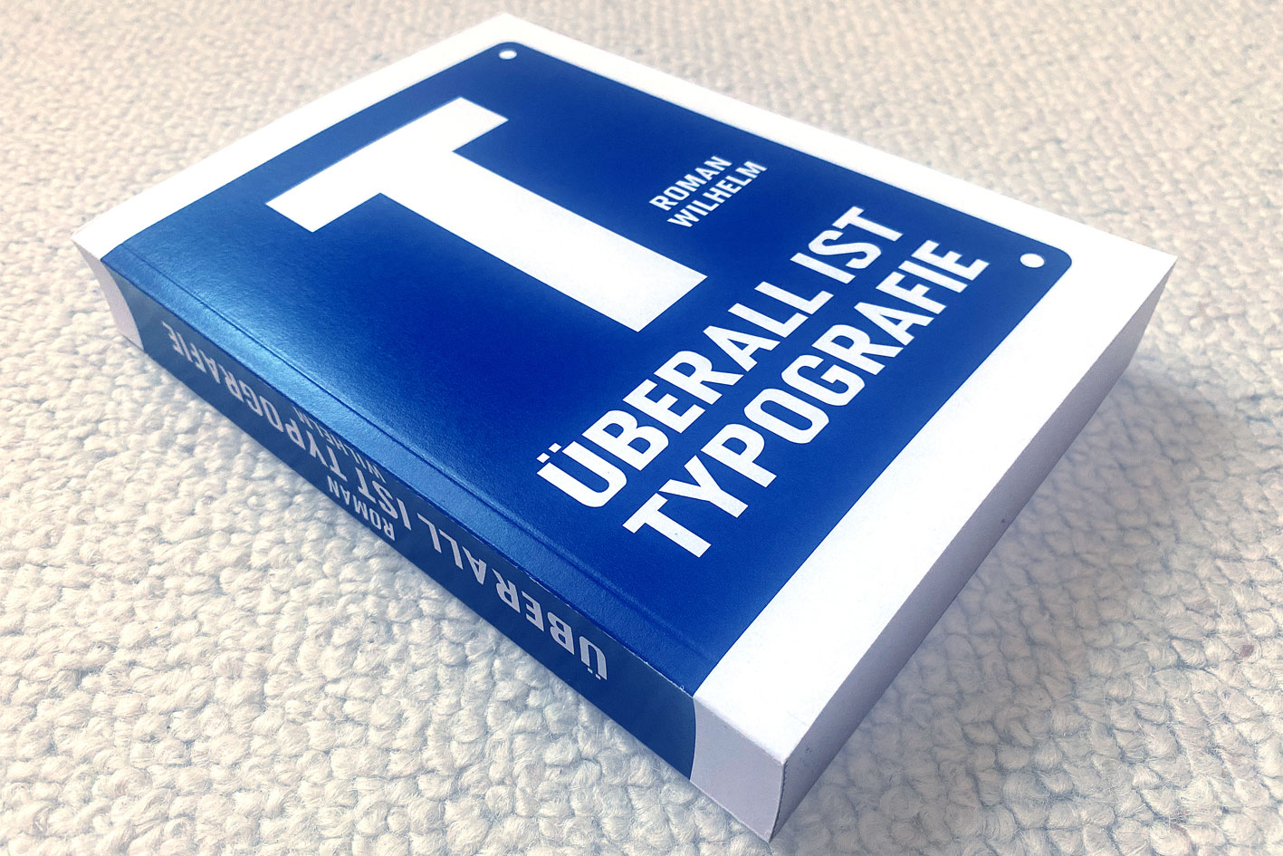
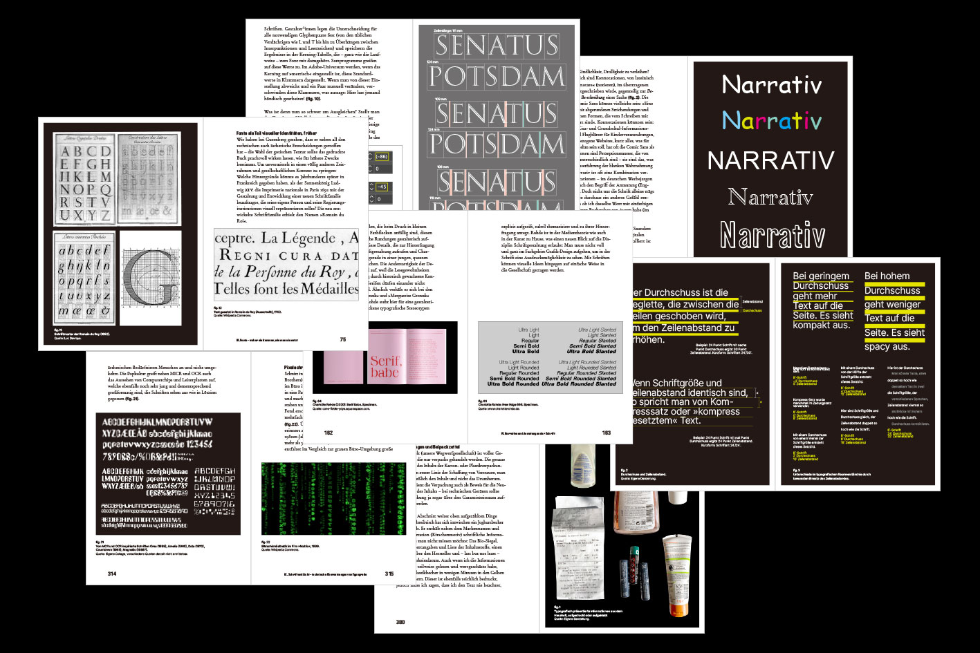
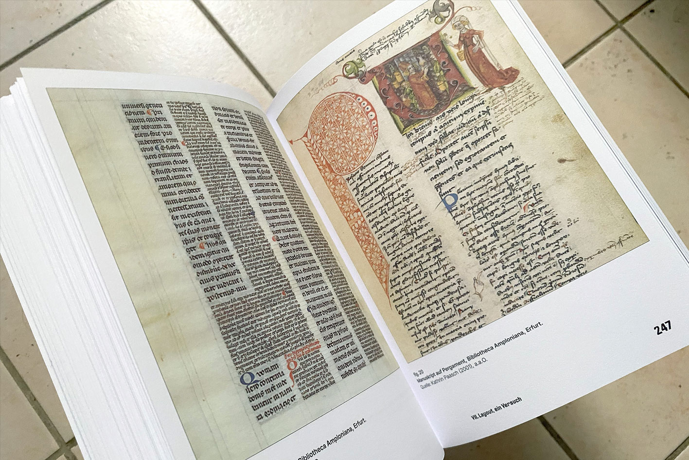
As a teacher at the Berlin University of the Arts Typography Lab, I am regularly holding a lecture series. Since students are distributed across a variety of studios and specializations (graphic design, illustration, spatial design, campaigns, new media, moving image, social and science communication, architecture, …), I tried to approach typography from its omnipresence. The book emerging from this process tells a story between aesthetics, societies, and technologies—a true balancing act. Ten chapters focus on (Part 1: The Typographic View) script and writing (personality), the reversal of vision (optical adjustments, metrics, kerning), fonts (history, industry, corporate, licensing), narratives (aestetics, big names, messy history), composition (left-aligned and block type), the chase after the shape (styles and formatting strategies—character, paragraph, object), an attempt on layout (historic, grid, creativity), the chase after the shape (OpenType and CSS formatting), (Part 2: Typographic Culture) Type and light (neon advertisement, modular grids, pixels and screens, silent film typography), typography and cultural identities (Shanghai, Chinese typography), typography in everyday life and politics (product packaging, urban context, headlines). This book is in the process of being published.

Roman Wilhelm (2025): Überall ist Typografie (Everywhere is Typography). 420 pages, 14,8 × 21 cm. Forthcoming.

Überall ist Typografie (Everywhere is Typography). Examples of spread pages.

Überall ist Typografie (Everywhere is Typography) with a crush on fascinating medieval manuscript layouts.
Academic work
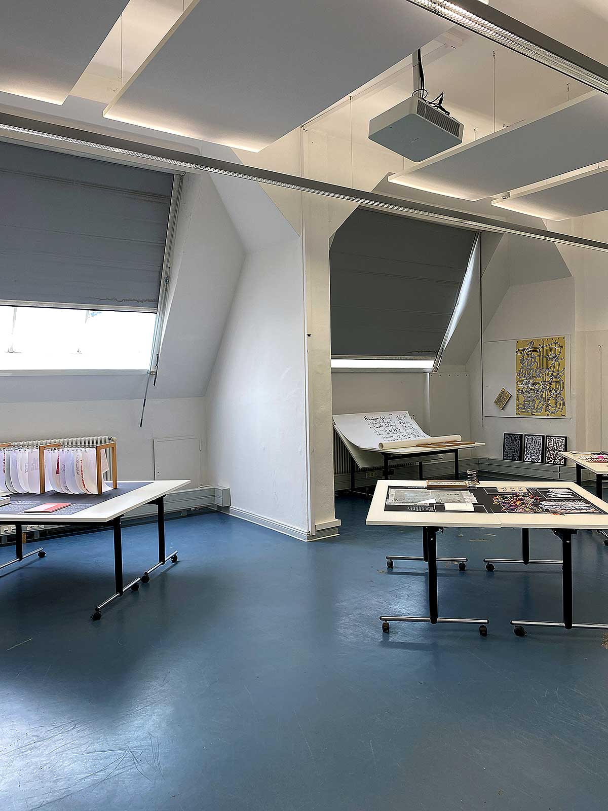
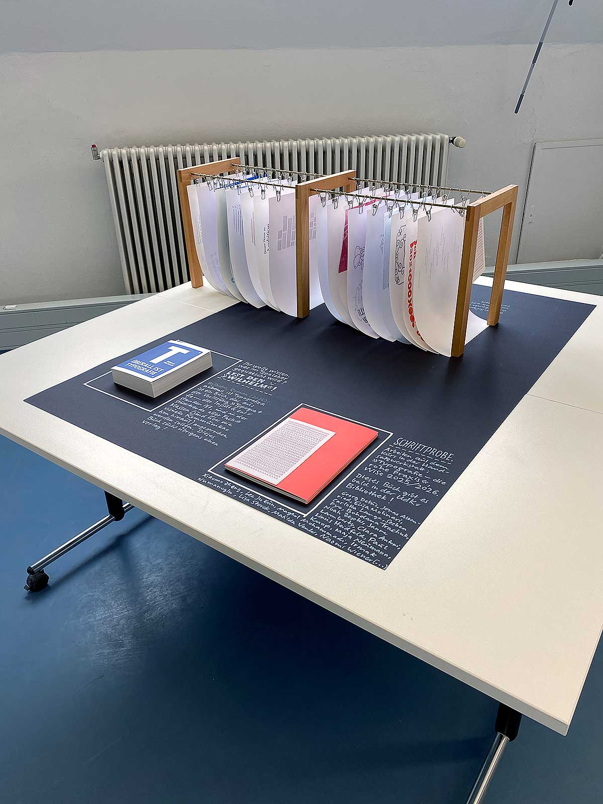
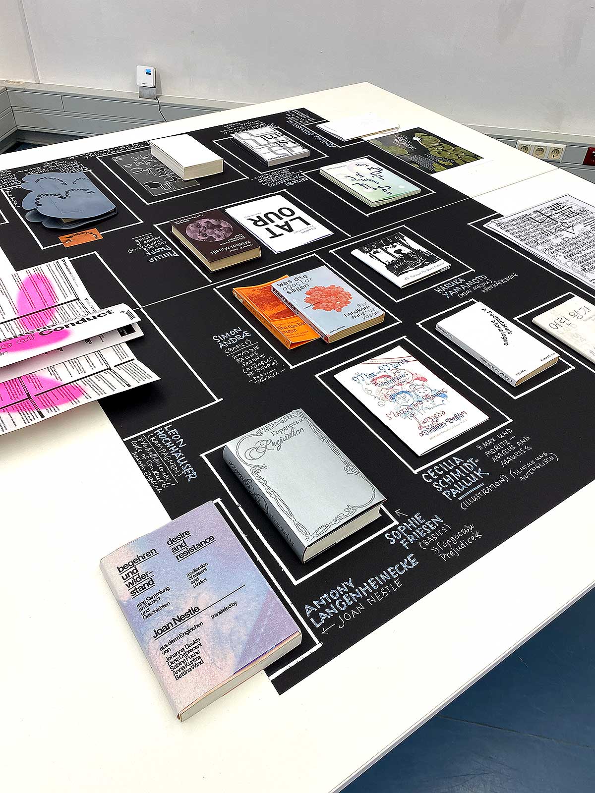
I have been an academic teacher for 20 years now. It all started during my master class (Meisterschüler) at Leipzig Academy of Fine Arts back in 2006. From that on, I had positions at Burg Giebichenstein Halle (Saale) University of Arts, Braunschweig University of Arts, Hildesheim HAWK University of Applied Sciences and Arts, Dortmund University of Applied Sciences, Hong Kong Baptist University Acadeny of Visual Arts, and Berlin University of the Arts, which is where I am constantly now. Besides two regular lectures in typography, I am responsible for a growing letterpress studio. Find more details on our bilingual page udktypo.net, and have a look at a some student works.
Some impressions of the 2025 UdK Rundgang annual show, contribution by the Typography Lab.
Graphic design in a scientific context
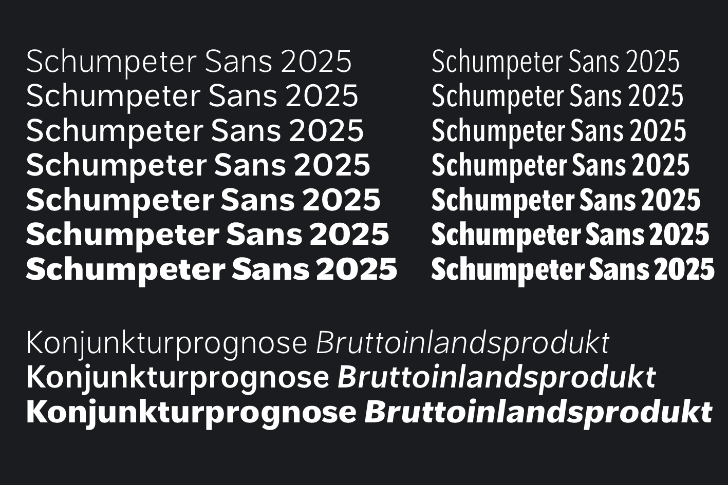
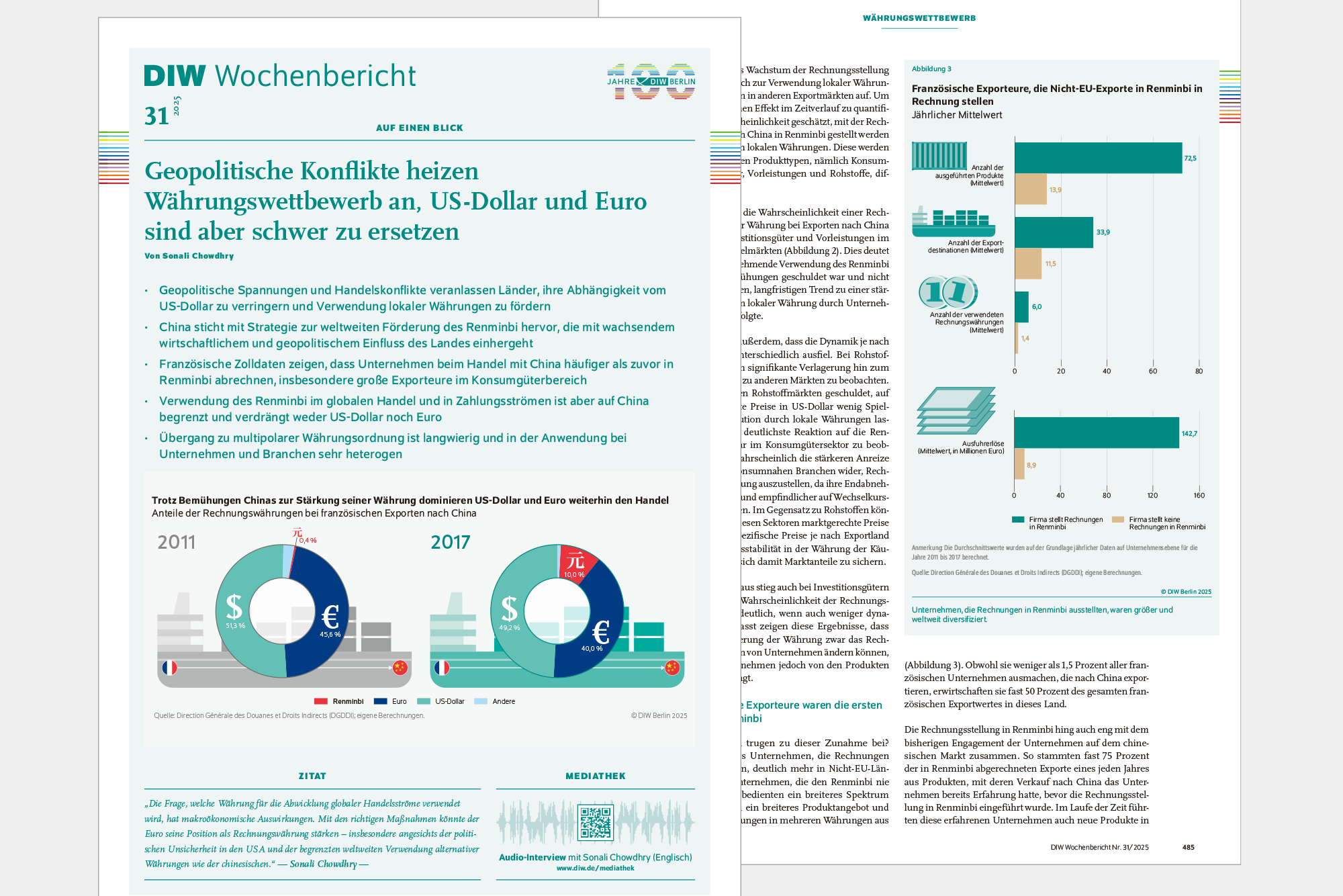
In the communications department of the German Institute of Economic Research (DIW Berlin), I belong to a three-piece graphic design team. Together, we are involved in the information graphics, editorial design, and production of our flagship periodical, DIW Weekly Report, published since 1928. Having started out as a letterpress brochure, it underwent all significant changes to printing technologies, and is now a print/responsive html/accessible pdf format with all its contemprary interconnectedness to social media. During a year-long process of re-design, I developed a custom font family, Schumpeter Sans (named after influental economist Joseph Schumpeter), which I newly produced as a variable font in the context of the institute’s 100 years celebration in 2025 and the anniversary microsite. The design objective was to combine a rather geometric normal width with a more ‘grumpy’ condensed, as to subtly hint to the ever-present difference between scientific finding and political opinion.


Above: Schumpeter Sans variable font family specimen (2025). Below: DIW Weekly Report. Infographics, typography, editorial design, visual identity (2017–) starring Schumpeter Sans paired with Martin Majoor’s Scala Pro.
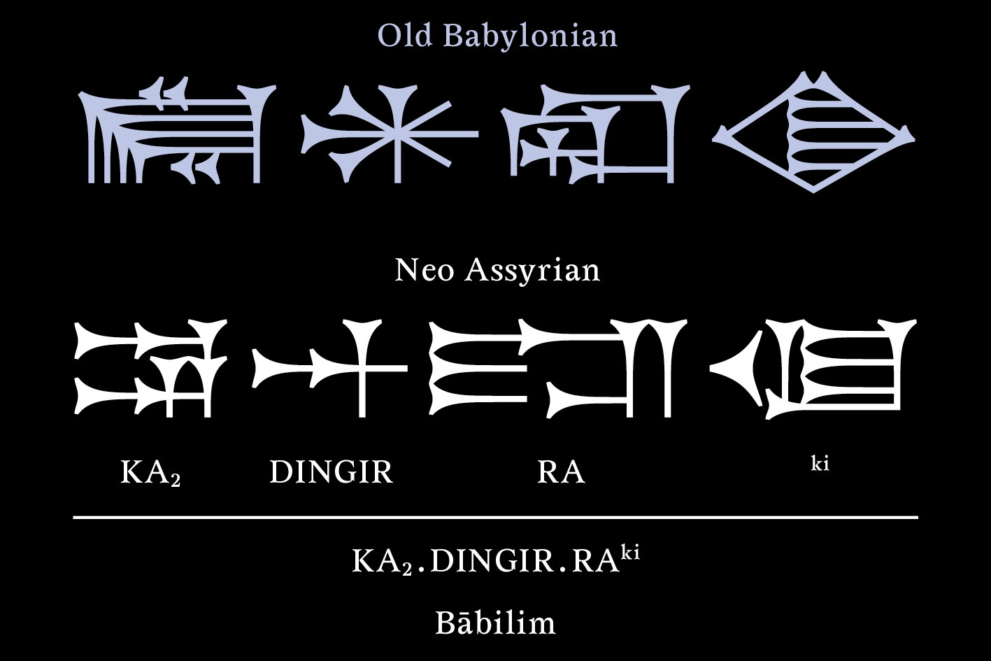
An ongoing project is a new type family for different shapes of the Cuneiform script. Starting from the question, what typeface design and typography can contribute to science, I set out to ask around at the Seminar of Ancient Oriental Studies at Goettingen University, to where I was invited for a talk in July 2023. In the same year, I had the chance to present my approach at Paris ATypI Conference.

Cuneiform font family, Times New/Old Akkad, work in progress.
Contact
Roman Wilhelm
Email: roman(a)roman946.de
Bandcamp: roman946
Instagram: @wilhelm.roman
Linkedin: Roman Wilhelm
YouTube: @roman946di
Soundcloud: roman946
UdK Berlin, Typography Lab: www.udktypo.net
Instagram: @udktypo
