
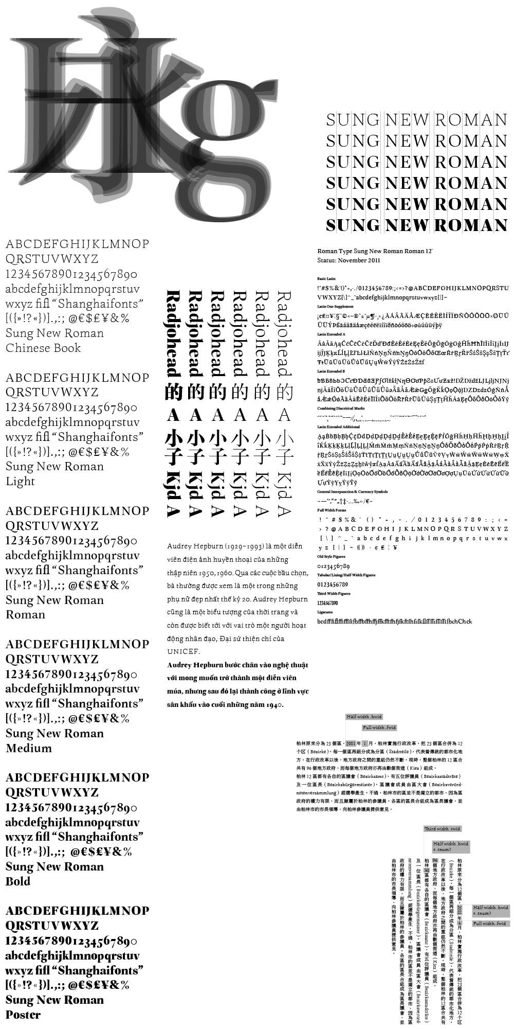
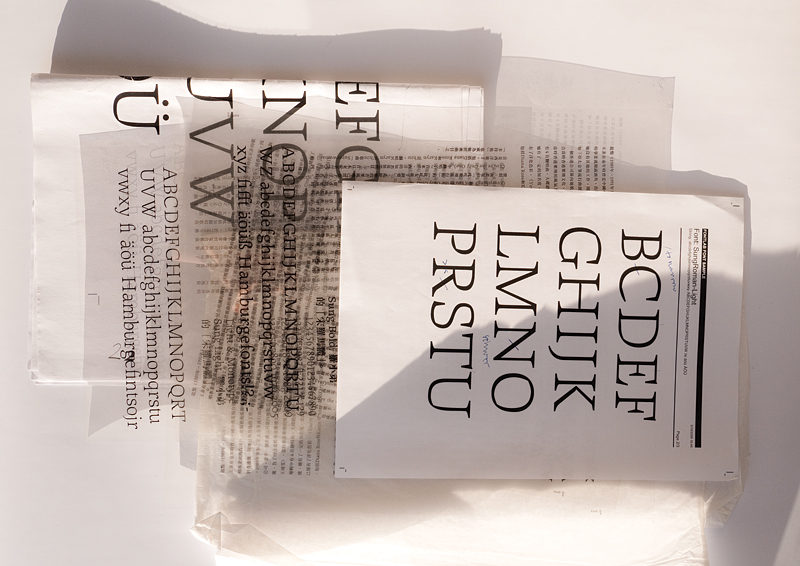
Sung New Roman, a Latin family made for Chinese typography, 2006–
The term sung (宋) means Chinese book type, corresponding to Latin serif type. Although the CJK version of InDesign allows you to automate Latin-Chinese font combinations (composite fonts 複合字體), this does not guarantee that these fonts aesthetically fit to each other. Chinese and Western reading habits differ from each other. To mention only one example: Common book weights of Chinese fonts are significantly lighter than their Latin equivalent. What the West regards as regular is medium to Chinese typographers. A Chinese book weight is an extra light to Western Latin users. Chinese fonts are monospaced and constructed of varying stroke weights. A CJK Latin has to feature full-width, half-width, third-width forms, vertical kerning, special accents and punctuation, ...
The requirements that a CJK Latin has to meet need to be integrated in their design. Yet there is a lot of room for individual conclusions, I took mine. To name an example, the letter width is identical in all weights. Sung New Roman features six weights: Chinese Book, Light, Roman, Medium, Bold and Poster. Italics, Small Caps and diverse Open Type styles are in development. Vietnamese language support is an important aspect of development.
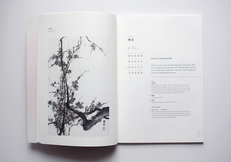
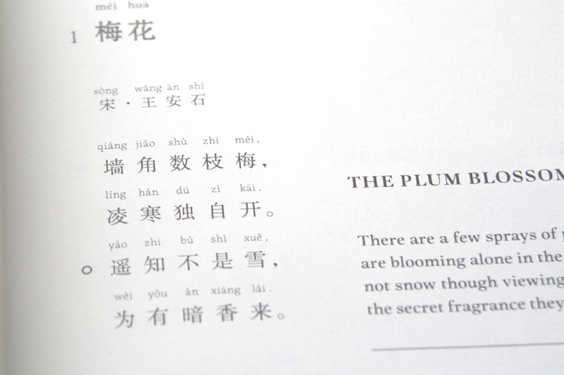
In use: 山水間 Shan Shui Jian (Amid Beautiful Landscapes), poems by Yuan Lili. Designed by Yimeng Wu.

 Sound 聲音